How to design a landing page that converts
Learning how to design a landing page is crucial for your online business. A good landing page can help increase your email leads, which could lead to potential customers in the future. Your landing page needs to be congruent to the platforms that led to your audience arriving at your landing page. There are many things you can use to create your landing page, but I would say use something that is easy to use and affordable for you. A landing page created well, can convert, and generate a high number of leads which could turn into customers.
In order to create a good landing page, you need to create a compelling headline that attracts your ideal customer and speaks to their desires and/or pains. You must also create a graphic relating to your offer, or a picture of you. Furthermore, bullet points of the benefits are essential for illustrating why your offer is useful. Finally, testimonials, a background story or information on you will also help to solidify the benefits of your offer.
How I started
I spent a lot of money to get an education around how different entrepreneurs have developed their online funnels. I started to realise their information was good from a foundational point of view but was outdated on many fronts. This was evident as I was being exposed to different offers that weren’t being taught. I started to realise that in order to be a step ahead, I needed to see what people were doing in my market
Checking your competitors

I created a list of 40 thought leaders in my industry and put them in a Google sheet. This table consisted of the following:
- Fb Ad Copy length
- Ad graphic
- Advertising Objective
- Landing page link
- Button colour
- Background colour
- Pictures used
- Features on the landing page
- Type of Offer
- Comments
I then went on their Facebook pages and clicked on the tab “Info and ads” which showed all their Ads they are displaying. Then I would click on all Ads and observe and record what they have on their page.
Funnel Builders
Creating a landing page requires you to use the right software. There is a range of different software that can be used to build landing pages and thank you pages. Software include:
- WordPress plugins and themes
- Leadpages
- Kyvio
- ClickFunnels
Below I will highlight what is required to develop a good landing page.
Creating your landing page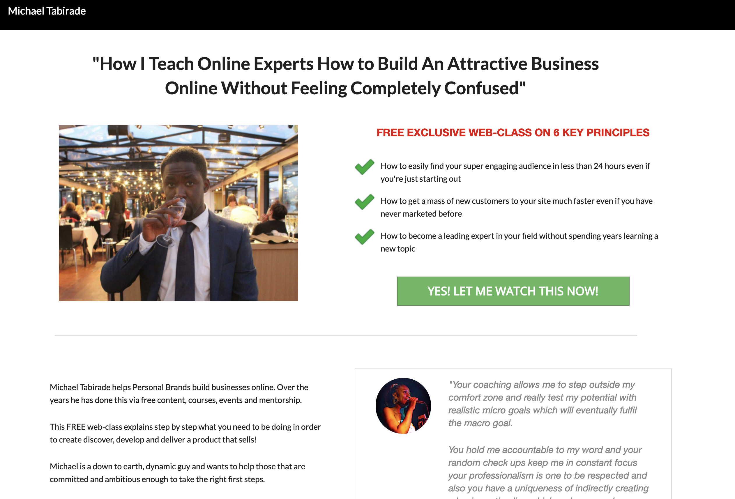
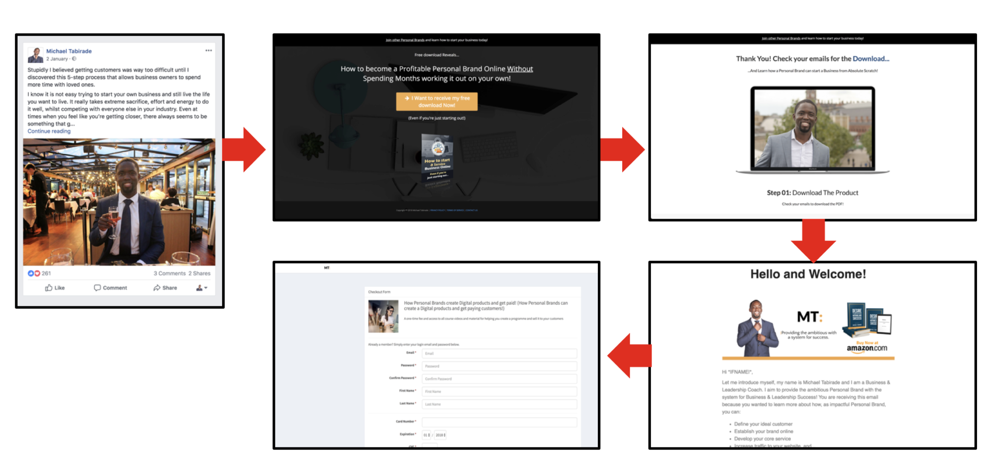
A landing page is a single webpage that draws a target audience to an offer that may be of interest to them. If the person enters their details in order to receive the offer, then they have the intent to get a specific problem solved.
Lead magnets
An offer is usually known as a lead magnet. There are many different types of lead magnets including but not limited to:
- Webinar
- Video training
- Video mini course
- Email course
- Mini-course
- Audio-training
- Audiobook
- ebook
- White paper or report
- PDF Checklist
- Tools and templates
- Book a free session
Based on your competitor research, you’ll know what your audience is used to seeing. Typically I would stick to what they are used to, and focus on creating really good content for them. In my humble opinion, video related lead magnets are very useful as they create high engagement and are more likely to create better quality leads. However, booking a free 30-minute consultation may make sense if you are a consultant.
Headlines
Have a bold strong headline that highlights the problem you are solving (pain) and maybe add the benefit (desire) at the end. You can also start with the benefit first and end with the pain. It should be an H1 heading that is big enough, but not overwhelming on the page. Experiment to see what works. “How to…” is always a great way to start.
How to lose 3kg in 3 days without sweating like a pig in the gym
In this example, I have started with the benefit, and ended with the pain. Look at what your competition is doing to get a feel of what works. The market research you do on your customer beforehand will also help a great deal.
Subheadline
This backs up the headline with emphasising or clarifying the benefits offer (in this case the headline). It should be bold but not overpowering the headline. It should be too big neither. You don’t always need a subheadline but it depends on the design and feel of your landing page.
Bullet point the benefits
Clearly, state what benefits a person will get if they opt into your offer. The benefits are not the same as the features, however, they focus on end states that they will achieve if they accept the offer. Benefits usually highlight experiences, feelings or states that a person can have with they opt into the offer. This includes using words like confidence, understanding, feel, create etc.
Graphics
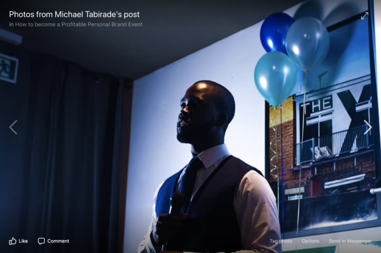
As a personal brand, you should use a picture of yourself showing you doing something related to your niche. This could be of your public speaking, coaching, working out or training. It could also be a smart or smart casual, clean picture of you that is a good quality shot. A good trusting smile always helps to develop likeability. You can also do a video states who you are, your background, why you do what you do (maybe in story form), and the benefits of the product with a CTA.
Copy text
Create a quick background on who you are and what you, and examples of things you have done. But you also want to show why the offer would be useful and how it could benefit your potential lead. This shouldn’t be anything too long, but should succinctly explain each point.
Testimonials
Have 1 – 5 testimonials on your page of people you have actually worked with highlighting the benefits of your offer or services to them. The testimonial could include a picture of the person, and should definitely include a positive and helpful statement from them, including their name and title. You may want to create a video testimonial dependent upon the design and feel you are going for.
Button and Submit forms
Use a button that stands out and uses a simple font. The text can be capitalised. It should also state a level of confirmation, urgency and “clickability.” You may need more than one button above and below the page. Usually words such as “Yes!” indicates a micro-commitment. For example:
“Yes! Show Me The Goods!”
The submit form should pop-up upon clicking the button. This should include a headline that indicates what the offer is, a call-to-action served as a subheadline, then a name field and email field (required). In addition, there needs to be a GDPR tick box that clearly states they are happy to also receive additional information about your niche topic. Please check GDPR regulations for further clarity. This is to make sure you are completely transparent with what you are doing. You may also want to provide links to your Privacy policy and Terms of Service, and also state “Your Privacy will always be protected” for assurance.
Integrate your autoresponder
It is very important to integrate your autoresponder to your landing page. This is usually done to the submit form. If you do not do this, then you will not be receiving any new leads, and you may be wasting monies for no reason! Test everything before you publish the landing page. You also want to make sure you create the right email sequence before you make the landing page public.
Install your Pixel tracking
Add either your Google tracking script code and/or the Facebook Pixel to your landing page. This is to help you identify the behaviour and activity on your page. This is very important, informing your decisions going forward with your landing page. You’ll be able to check how many leads you have, and how many people converted from your Ad to your landing page.
Make sure your landing page is mobile friendly
About 70% of your traffic is going to be from mobile. It is essential that your landing page is mobile friendly or responsive. Test what it looks like on different devices by Inspecting the page. This step is important, otherwise, you may get embarrassed. What it looks like on desktop is completely different from what it may look like on a mobile device.
Read Facebook’s Ad Policy
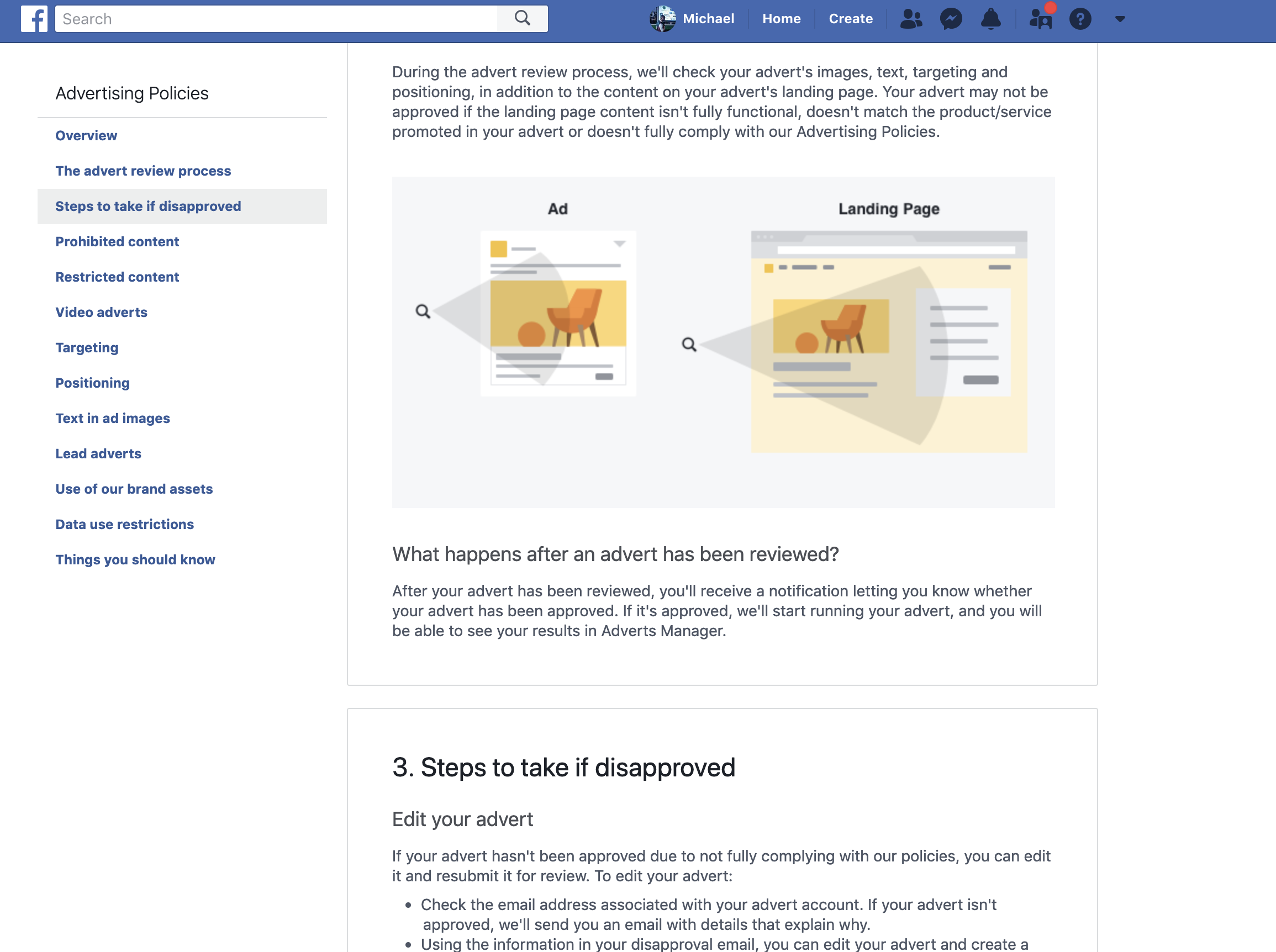
Facebook checks your landing page if you are setting up an Ad. Before you create any Ad, make sure you read their Ad Policy. It clearly highlights what you can and cannot do. It isn’t that long so make sure you read it. Facebook wants to make sure you don’t show any negativity or bias towards any group of people, making sure you are as clear as possible with your advertising offer. You can also speak to Facebook’s Ad support, who may be able to help you if you face any difficulties.
Legal documents

Make sure you have legal documents in place including Privacy Policy, Terms of Service and possibly Disclaimers. This should be easy to find and centred at the bottom of your landing page. If you have difficulty creating one, please seek professional and legal help. There are templates available online but you are liable to your own risk. I have to say that as I am not a lawyer.
Fonts
This is an easy one. Make sure all your fonts are sans serif i.e. don’t have any sqiggles or tails etc. You want the text to be a legible as possible and not complicated. You can choose a nice font like lato or montserrat. I find that Google fonts are simple and familiar to a lot of people’s eyes.
Call to action (CTA)
Develop a call-to-action underneath the buttons, on the submit forms, and in the video or image directing people to opt-in for the offer. If you don’t add a CTA, your conversion rate will be lower than what it should be. It can be as simple as “Click on the button below.”
Thank you Page

A thank you page is not that different to a landing page in terms of how it is created. Your thank you page must indicate a CTA for example:
Congratulations! You can now go to your emails to get started on your vide training!
Your thank you page can also have additional information that urges people to do another CTA such as:
- Purchases a low-barrier One-Time-Offer (OTO-1)
- Get some exclusive training on the spot via video
- Follow you on other social platforms
- Join a community like a Facebook Group
It’s up to you what you want to do, but keep it simple in the beginning before you add any crazy variations. Make sure your pop-up submission form on your landing page redirects the lead to the thank you page after submission of their email address.
Summary
Landing pages, when done properly in conjunction with a good offer and good Ad (or content strategy), can be crucial for your business. Create a landing page that reduces the opportunity for your audience to leave the page. Your landing page should increase the opportunity for your audience to opt-in to your offer. It starts with knowing your customer’s pains and desires, needs and wants. Then you must create a compelling offer that has high perceived value.







2 Comments
Comments are closed.